Sure, I can try my best! I’m not a good teacher like, at all, I only have experience in Photoshop Cs6 / Photoshop CC. I also use a specific brush that you can download HERE, which works for the photoshops I list above. I tried using the same brush in CS5 and it didn’t quite work, BUT you can pretty much use the way I ink with any brush. I use that brush for sketching, inking, and shading ^u^
First off, PATIENCE! PATIENCE IS THE BIGGEST KEY!!!! It’s so easy to get frustrated and bored with linework, if you find yourself rushing too much; step away. Put that away for tomorrow and come back to it fresh minded. I do it all the freakn time xnx’
1. Depending on what I’m planning on working on, I use HUGE canvas sizes. If I don’t plan to do a detailed piece, I use 2000×3000 canvas sizes, but if I know it’ll be sooper detailed or it’s a commission, I use 4000×6000.
Once I have a sketch done, I’ll turn down the Opacity of the layer to around 20% or lower.
2. These are the settings I have for the pen I use. Pretty much for any pen, I have them at size 4-7 with the Spacing turned all the way down. The varying sizes depends on how big the canvas is and how thick I want the linework to be.
3. The base linework is pretty simple, just outlining things. I wouldn’t keep the lineart like this though, time to add some line-weight! This is something I still really need to work on myself, my apologies 
4. Adding extra ink to places where there’d be shadow can give the linework some more depth! I tend to do it where there are creases, and of course where they’re might be a lot of shadows (I’d honestly plan where your light sources will be ahead of time. If the light source is coming from the top left, have the thicker lines of the lineart lean away from the light (so, have them be on the right of, so like Bhailiu’s face here would have thicker lining on the right side of it’s face. I didn’t do that here but YEAH trying to describe stuff!).
5. I love cross hatching, though I don’t do it very consistently. I tend to add smaller, defining lines to bring out the shape of character’s faces, textures of things, etc! If you’re expecting to shade your lineart, I wouldn’t go too crazy with em. You’ll end up losing a lot of these little lines when you shade, or they don’t quite fit the shading sometimes. These lines look best for just lineart, or flat colors!
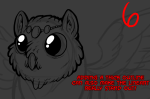
6. Lastly, this is a thing I used to do. Doing a really thick outline can REALLY make the lineart stand out, but I wouldn’t suggest doing this if you’re going to do a background too. This is best for solo pics just to have the character really pop out!
I really hope this helps! Apologies if this is just confusing or unhelpful >n>’ ALSO, HEY OTHER ARTISTS!!! If you have suggestions or know of some really useful tutorials/resources to add to this, please do!
~Weird Hyenas